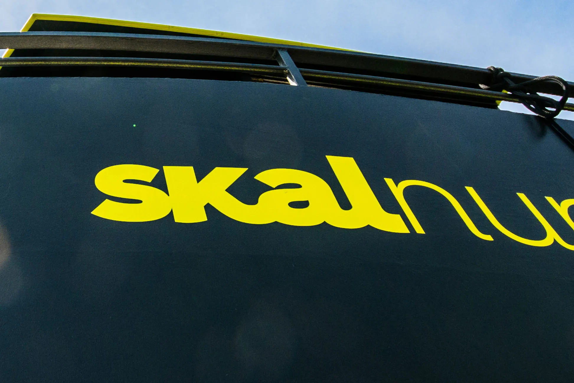

Close-up of the yellow-green skal wordmark applied to the vessel’s black hull, nuphar continuing in lighter type off the edge of the frame under the upper deck.
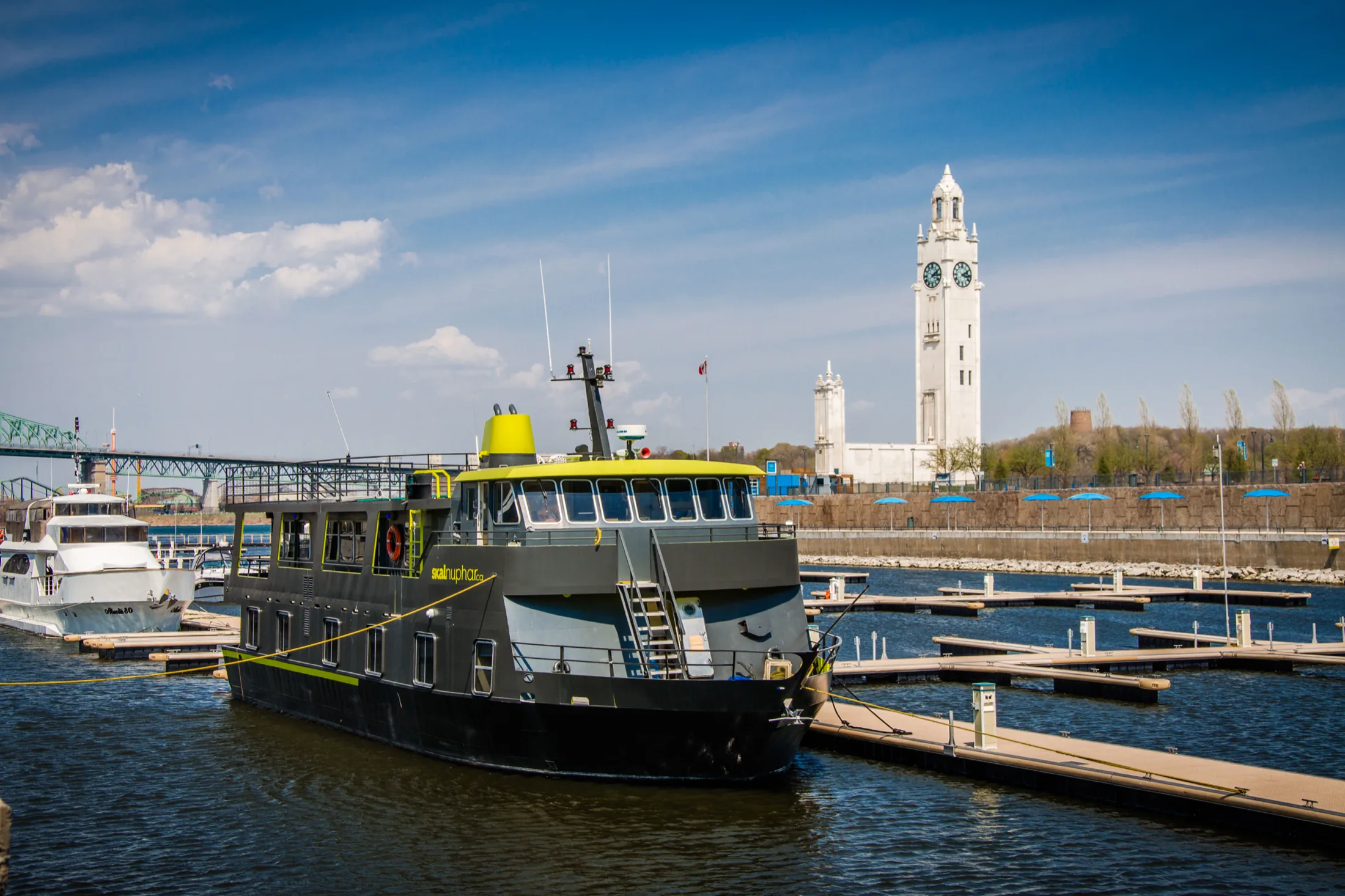
The Skal Nuphar moored in the Old Port of Montreal, its black hull and yellow-green trim set against the white Clock Tower and a row of empty docks.
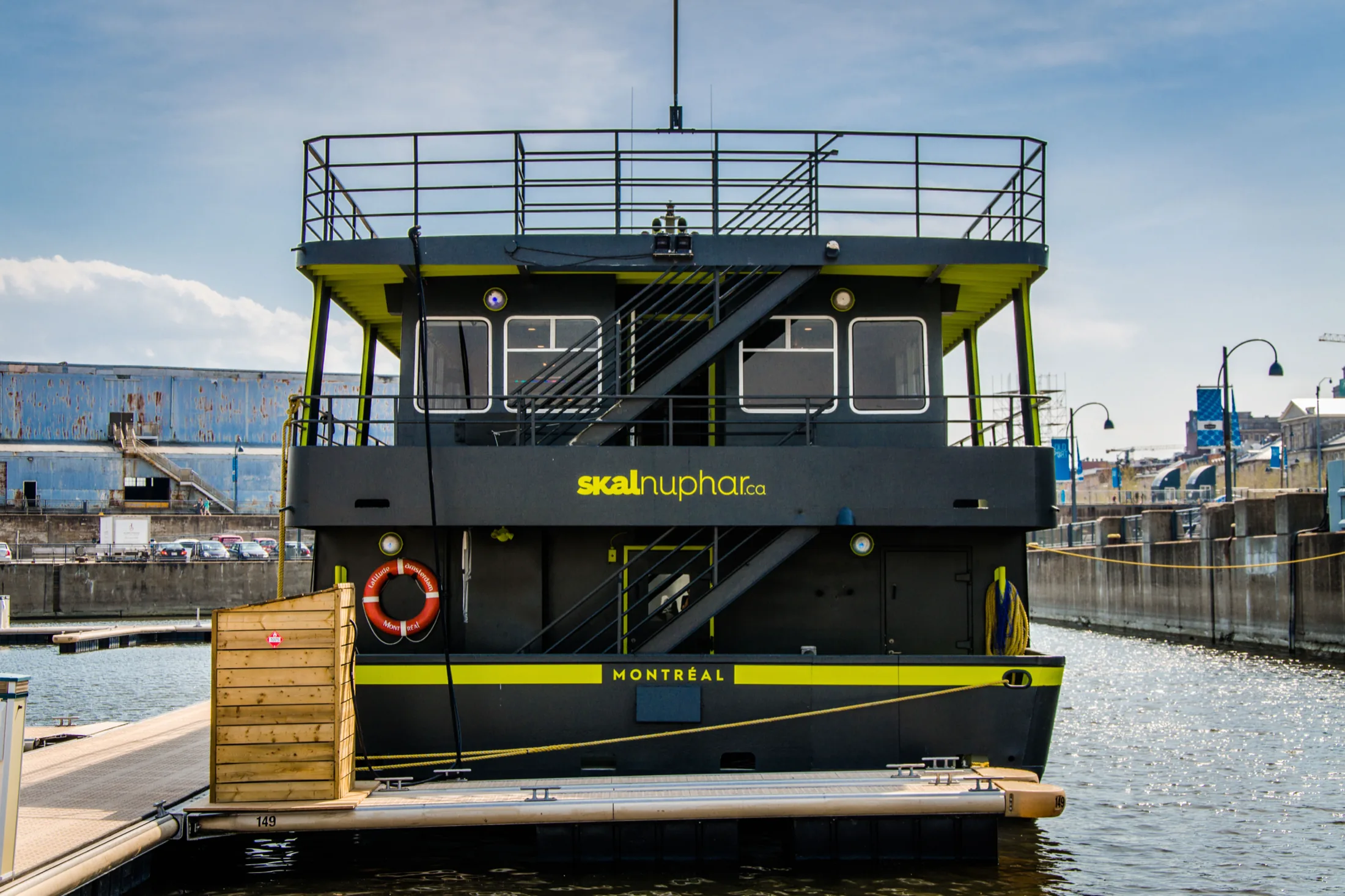
The stern of the Skal Nuphar from the dock, skalnuphar.ca set in yellow-green across the transom above a band reading MONTRÉAL, with the gangway and an orange life ring at the boarding deck.
Low-angle view of the vessel’s upper decks against the sun, the brand’s yellow-green carried across the underside of every ceiling and the skalnuphar.ca mark on the black hull below.
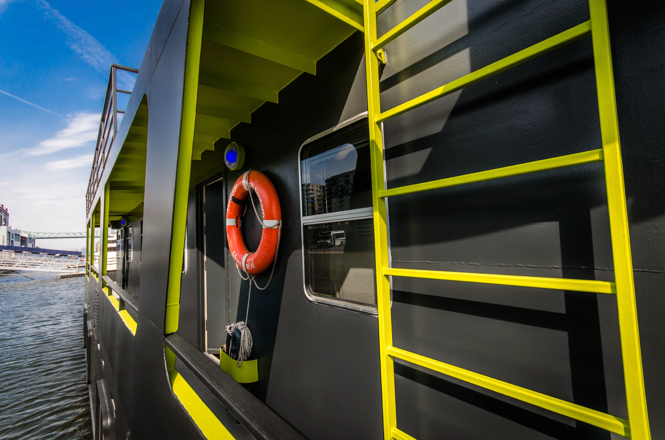
The vessel’s flank at the waterline, a yellow-green ladder painted up the black hull beside the cabin windows and an orange life ring hung outside a door.
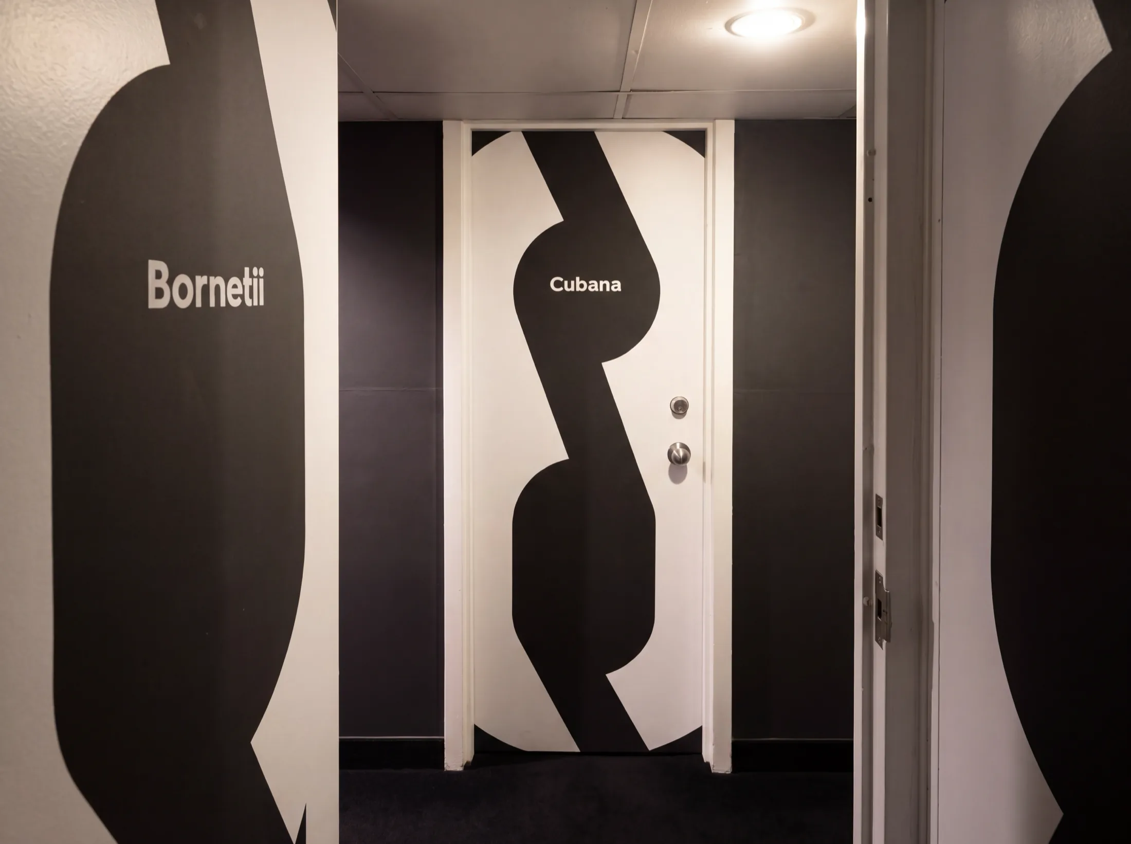
A cabin corridor on board, each door and wall carrying an oversized black water-lily silhouette with a species name set in white across it: Bornetii on the wall, Cubana on the door.
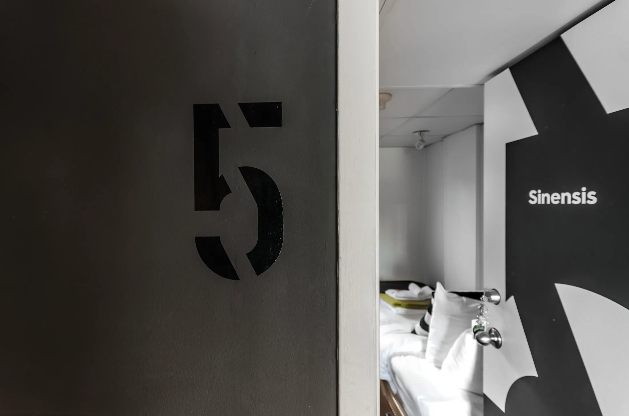
A cabin door numbered 5 in stencilled black, open onto a made-up berth, with the species name Sinensis set in white across the water-lily silhouette on the wall beyond.
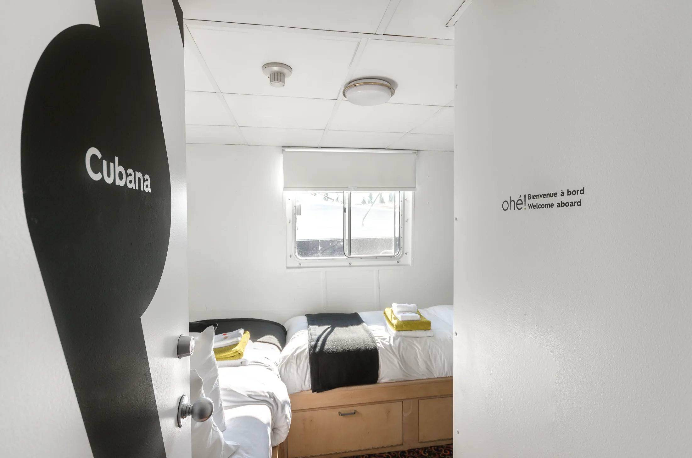
The Cubana cabin door standing open onto a white berth with folded towels on the bed, the wall opposite lettered ohé ! Bienvenue à bord / Welcome aboard.
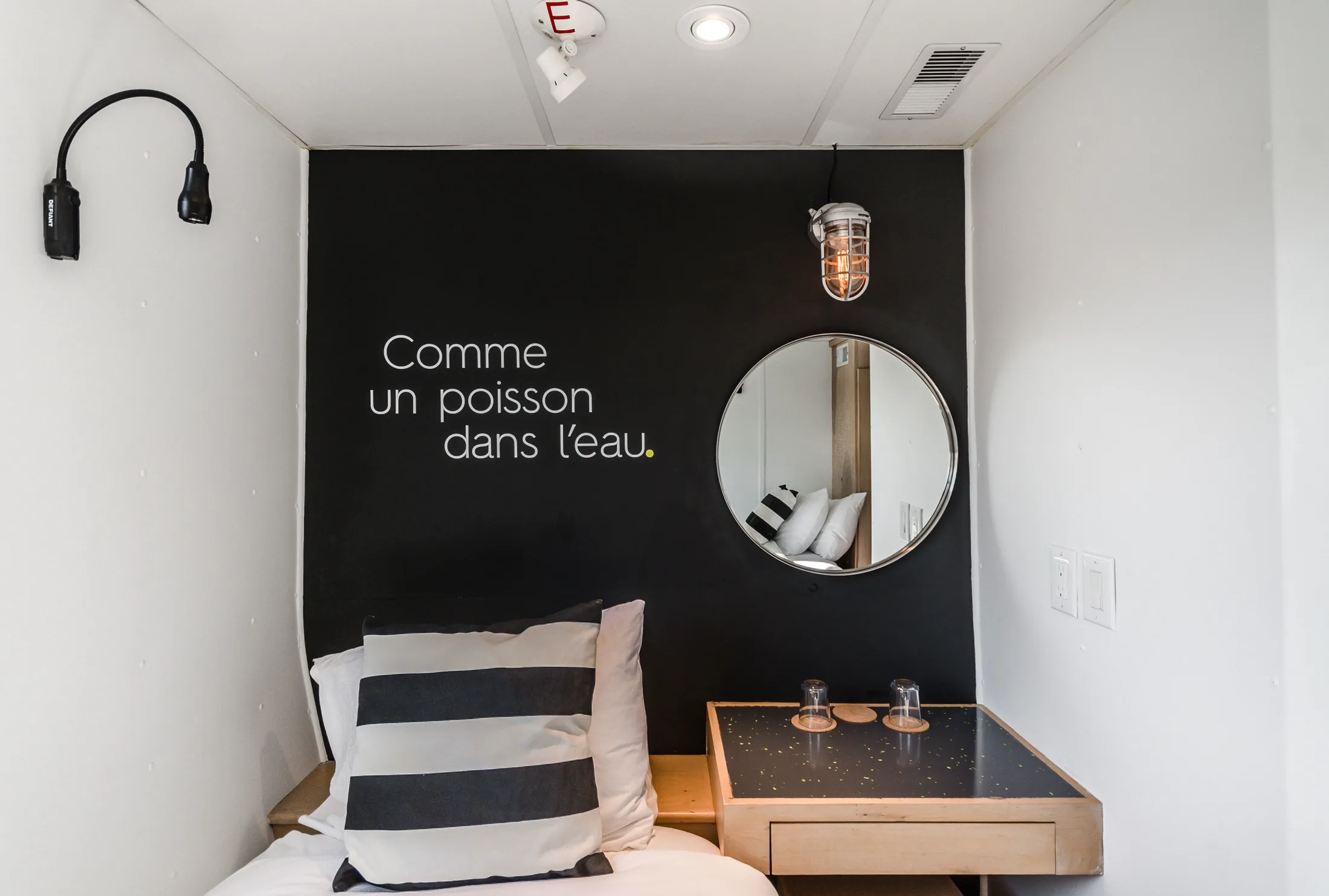
A cabin interior with a black feature wall reading Comme un poisson dans l’eau, a round mirror and a caged bulkhead light above the desk, and a striped cushion on the berth.

Skal

Skal turned a steel cruise boat on the St. Lawrence into a hotel in downtown Montréal.

NamingBrand identitySignageInteriors

The work ran from the name to the boat itself. Skal is Swedish for shell, which is what a hull is, and it was drawn as an umbrella — every vessel under it would carry a water lily of its own, the first of them Skal Nuphar. It covered designing the logo and the visual system around it, and taking that botany inside the boat, where each door carried a number and the genus of a different lily. The room signage was stencilled to read as shape before number, which gave the corridor a modern nautical look. Whimsy was added in the rooms, where the walls carried short written lines borrowed from the water. It extended to the vessel’s own look — a black shell where the river expects white, and the brand’s green carried under the ceilings outside the bridge.

What’s next for you?

Tell me what it is and when it lands.

Next project →