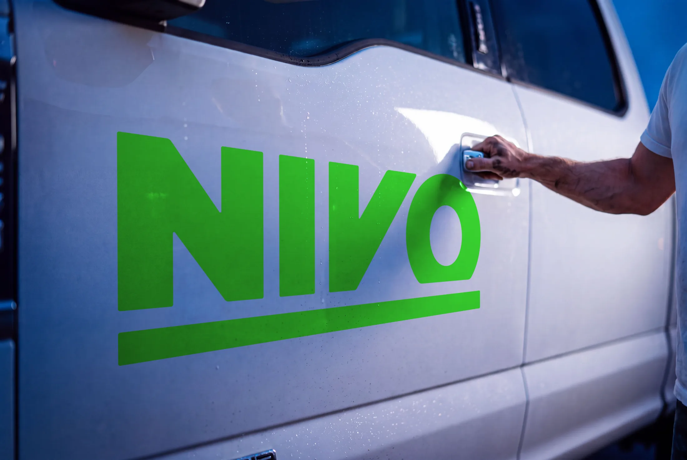
The green NIVO wordmark and its underscore rule applied to the white door of a work truck at blue hour, a hand reaching for the chrome handle beside it.
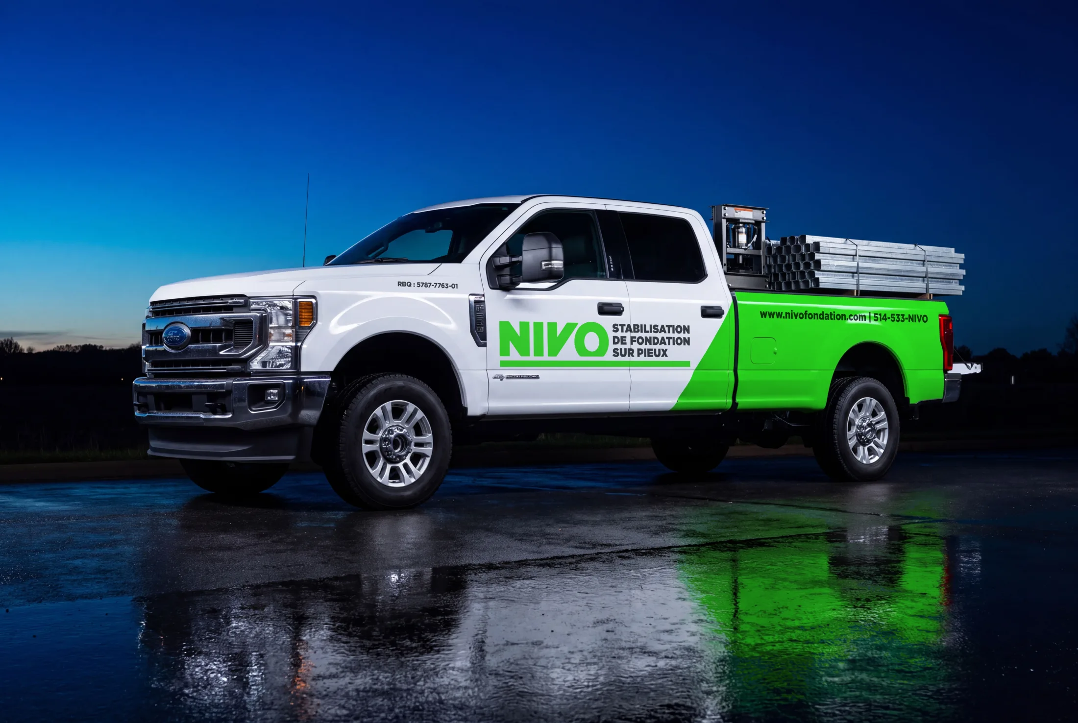
A wrapped white Ford F-250 in three-quarter view on wet asphalt under a deep blue sky, the green wedge running back over the box and galvanized pile sections loaded in the bed.
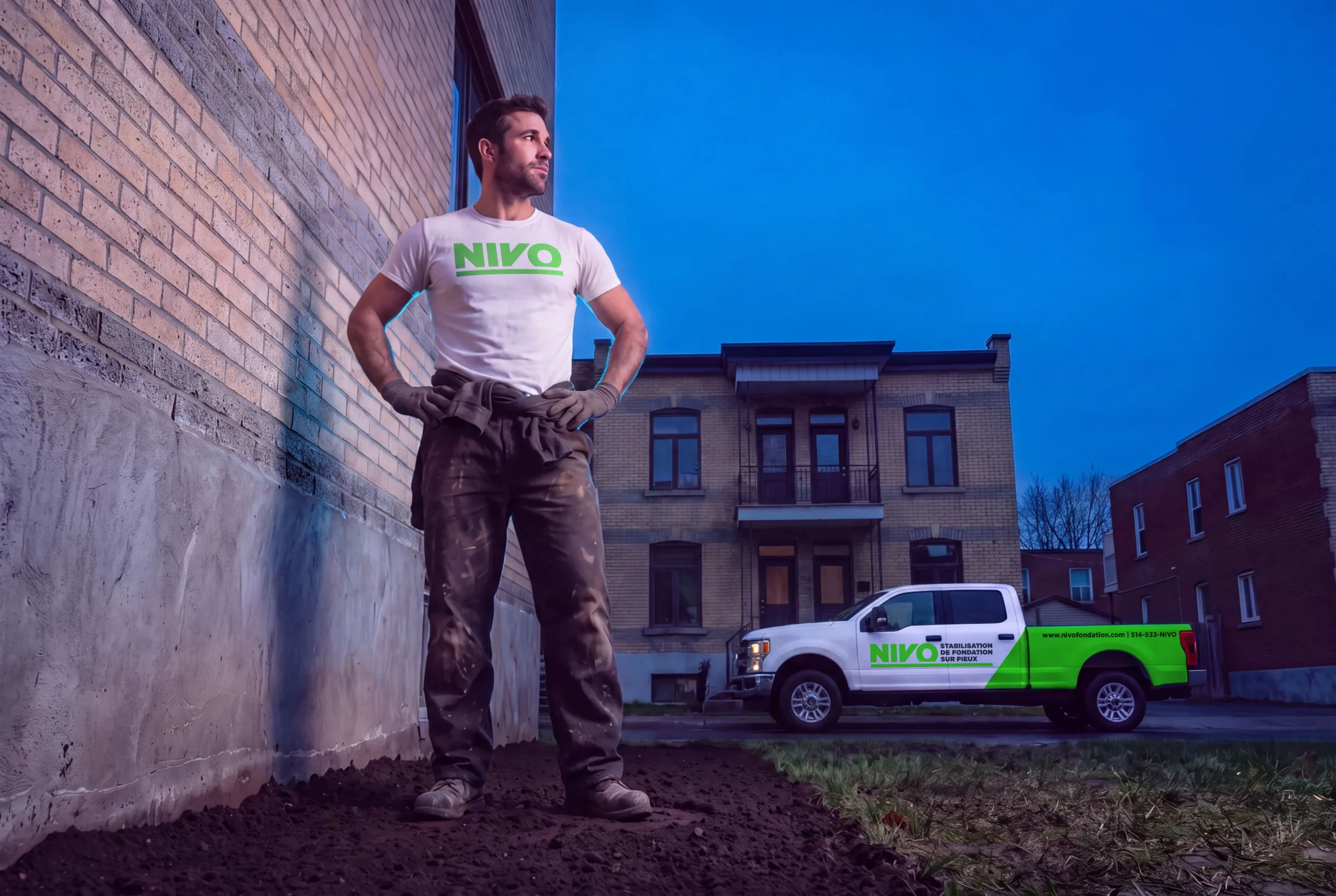
A worker in a white NIVO tee standing on freshly excavated earth against a brick foundation wall, the wrapped truck parked at the curb in front of a Montreal plex behind him.
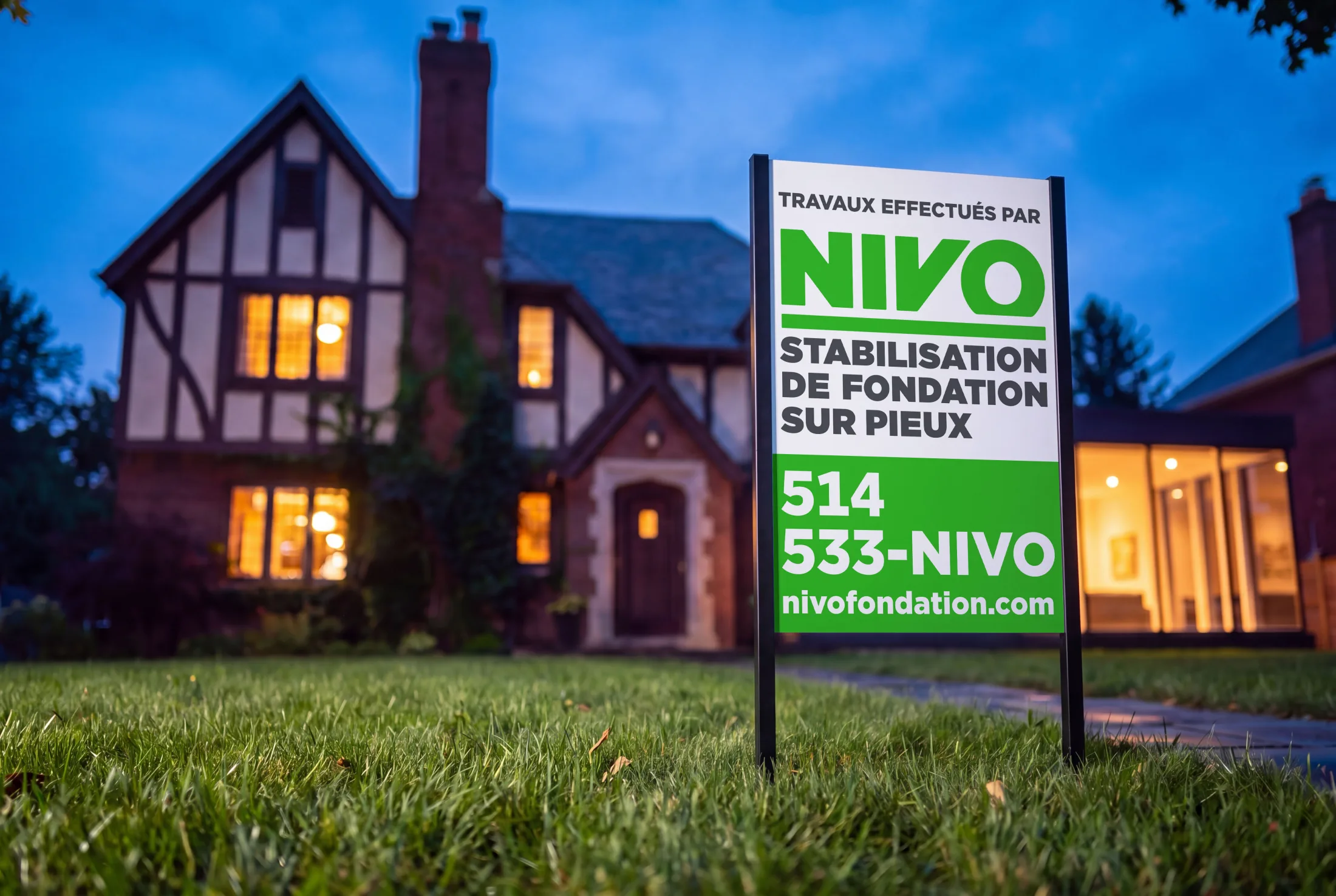
A NIVO lawn sign reading Travaux effectués par staked in the front grass of a lit Tudor house at blue hour, the phone number and web address on the green half of the panel.

NIVO

NIVO stabilizes and levels house foundations across Québec.

NamingBrand identity

The work ran from the name to the surfaces that carried it. It covered designing the logo and the visual system around it, on a fluorescent green chosen for the truck before anything else — the largest surface the company owns, and the one parked in a driveway where the neighbours see it. It extended that green everywhere else a homeowner meets the company, from the crew’s workwear to the sign staked on the lawn. The colour was the strategy: it buys a small company visibility for the price of applying it.

What’s next for you?

Tell me what it is and when it lands.

Next project →